In the world of marketing automation, the conversion rate is seen as one of the most important metrics out there. We do extensive A/B tests to find a way to optimize a form, try all the new tricks and hacks, and pray to the optimization gods for results.
Sometimes changes can be big and overwhelming, but there are days when all you need is less than an hour to get great results.
The Case:
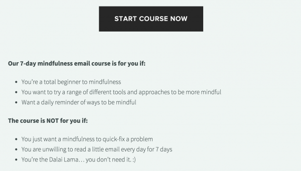
We need to optimize the conversions for the entry point of the sales funnel. The leadgen is a free 7-day email course that then upsells to the full 21-day version.
The optin form is a single dull green button that pops up to a LeadBox (see image below)
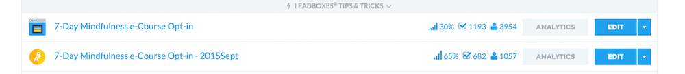
Existing CR for the LeadBox is 30% – not that bad at first, but it means that 70% of the people that clicked on the button lost interest when they saw the optin form.
The issue:
After reviewing the optin, the LeadBox and the landing page we had for the product, we decided we need to do some tweaks.
The plan:
We came up with 3-step action plan for optimizing the conversions for this offer:
- Change the sidebar button.
- Change the LeadBox design
- Update the landing page to give more information.
The steps:
1. Changing the sidebar button:
We started with optimizing the optin button. We went with a bigger, more descriptive image that sets the right expectations for the readers. This ensures that people will click with at least some level of interest because the offer is relevant to them.

Time spent: 15 minutes.
2. Changing the LeadBox design:
A LeadBox is a LeadBox – they are made to convert and they do it well. The problem with ours was the overwhelming quantity of text that was not formatted to be easy to read.
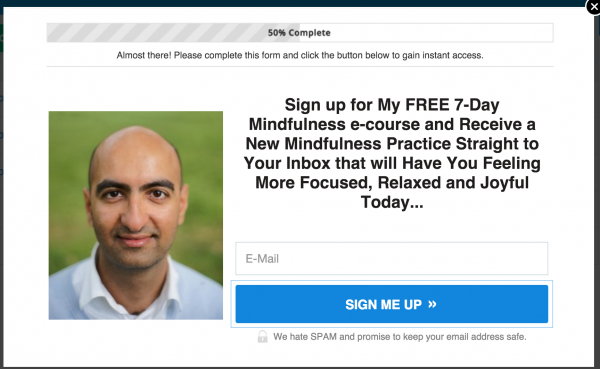
Our starting point – 30% conversion rate, too much text.
I decided to try a different approach – since we’ve already told people what they’re opting in for, we just explained it better, fixed some font sizing and positioning, removed the image of Shamash and created 2 versions:
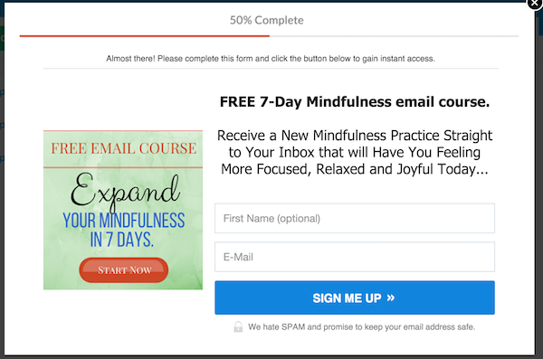
Version 1 – This one scored 62% conversion rate
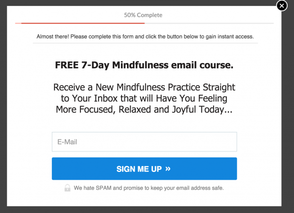
Version 2 – The winner with 65% conversion rate
Time spent: 20 minutes
3. Editing the landing page:
The landing page we started with was doing more harm than good. It had a confusing URI (/21-day-course), it was not giving a lot of information and it didn’t have ANY call to actions apart from the sidebar image and a short line at the end.
We fixed that by adding 3 sets of bullet points:
- Benefits of the program
- Who is it for
- Who is it not for
In addition, we added 2 buttons on the page – one in the middle and one at the end of the content.
Clear Call to Action and information about the audience
Time spent: 15 minutes (+ time spent to write the bullet points)
In total, we spent less than an hour to implement all those changes and the result was awesome:
We increased the conversion rate of the LeadBox from 30% to 65%!
The final results
It’s a great start and shows the immense opportunity of the program if we decide to optimize it more.
The truth about conversion rate
When evaluating the results I had to take in account not only the redesign of the LeadBox itself. The better conversion rate is an outcome of a focused evaluation of the reasons people were not converting. We knew that they needed more information, to be prepared for filling in a form before seeing one.
The added benefit of the landing page was that our audience knew exactly what to expect, is the content at the right level for them, and what they can achieve with it.
The truth is that conversion rate is never a single metric that is connected only to the form itself. Your website is the ecosystem that needs to give enough information and incentives to make it interesting and valuable to you to give your email address.
I could have tested how each of the changes performs separately before combining them – but in real life you need to act fast and fix all the issues as soon as possible. That’s also the reason why we don’t have original images from the website “Before” the optimization.
At least the results are worth it.